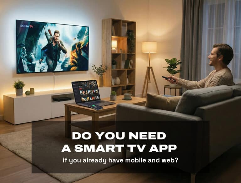
Ah, the exhilarating feeling after a long day at work. You have decided to treat yourself with a delicious dinner and a movie, all in the comfort of your own living room. The food is ready to be devoured, your drink is as chilled as an arctic breeze, and you have claimed the perfect spot on the couch. You open a streaming application to find something to watch. It should not take long, right?
But wait! As you navigate through the application, searching for that perfect movie, you find yourself caught in a labyrinth of confusing menus and annoying search options. The recommendations seem to loop back to the same few titles you have already watched countless times. Frustration starts to creep in, and before you know it, you are munching on cold food and settling for yet another re-run of your default go-to movie.
With the rise of streaming services and the increasing popularity of Smart TVs, delivering an exceptional user experience has become more critical than ever. Designing for Smart TVs presents unique challenges, from accommodating larger screens to navigating with a remote control. While TVs have revolutionised the way we consume media in our homes, people want easiness but also more features. It is impossible to satisfy every user and while trying, designers might end up with solutions that might be bit too complex. In this blog post, we will delve into the most frustrating mistakes encountered with Smart TV applications and provide insights on how to overcome them.
CLUTTERED UI AND INCONSISTENT NAVIGATION
When designing for Smart TVs, there is a bigger canvas for the creative work. However, the expanded space doesn’t give license to disregard essential design principles such as white space and logical organization. While the allure of innovation is strong, it’s important to maintain familiarity for users, particularly in terms of navigation. Navigating on a TV with a remote controller is inherently different from using a laptop with a mouse. Imagine a streaming application featuring categories like “New Movies,” “Awarded TV Series,” and “Best from Scandinavia.” Each category presents five movies or TV series. On a computer, finding the “See More” button after the list is straightforward, but on a TV, users might need to scroll through all items before reaching the button. Annoying, right?
A cluttered user interface disrupts a smooth user experience. It is essential to avoid overwhelming users with an excess of information or functionality on the screen. A cluttered UI can make it difficult for users to find what they are looking for and lead to frustration. Furthermore, inconsistency in navigation patterns across different screens adds this frustration, causing users to struggle while exploring the application.
Designers must approach Smart TV UX with a focus on conventions. Familiar navigation structures and patterns that users are accustomed can significantly enhance the overall experience. While innovation is encouraged, straying too far from established conventions can lead to confusion and user dissatisfaction. Testing and iterative design remain vital tools in understanding what aids the user and what adds unnecessary complexity.
HIDING ESSENTIAL INFORMATION AND PRIORITISING IRRELEVANT CONTENT
One of the key principles of good UX design is to provide users with the information they need, when they need it. A common mistake in Smart TV design is hiding essential information or prioritising irrelevant content. This misalignment can lead to user irritation. Consider, for instance, the scenario where promotional content takes all the space on the screen, overshadowing crucial details like program descriptions, scheduling, or playback controls. This approach hinders users from fast access of the information they seek.
A remedy for this challenge lies in a focused approach that concentrates on the core features essential to the application. Take, for instance, a streaming application. Here, the paramount features encompass discovering engaging movies and series, obtaining information about them, and seamlessly enjoying the content. By devoting attention to refining these essential features, designers ensure that users’ needs are met effectively.
Consider the common situation where users struggle to access the subsequent episodes of a show they’re watching. Prioritising intuitive navigation to effortlessly access different episodes enhances the user experience. Similarly, by understanding what information holds utmost importance for various user segments, designers can tailor the interface to cater to these needs. In this pursuit, simplicity emerges as a guiding principle – streamlining content and interactions to provide users with a straightforward and meaningful journey.
INSUFFICIENT VISUAL FEEDBACK
On a Smart TV, visual feedback plays a crucial role due to the viewing distance between users and the screen. As users navigate through the Smart TV interface using typically six buttons (up, down, left, right, OK, and back), the importance of visual cues cannot be overstated. Insufficient visual feedback can leave users uncertain about the outcomes of their actions or even unaware of system responses. This lack of clarity can quickly lead to frustration and a poor user experience.
To address this challenge, designers need to emphasize focus in their Smart TV UX design. Implementing clear and recognizable visual cues is essential to provide immediate feedback to users when they interact with UI elements. While adding subtle animations can enhance the visual appeal of the interface, it’s crucial to ensure that these animations are not only engaging but also informative. A well-placed animation can guide users and reinforce their understanding of the navigation flow, helping them feel more in control.
However, the consequences of insufficient visual feedback extend beyond user uncertainty. In fact, it can lead to critical errors and unintended actions. When users are left guessing about the system’s response to their inputs, they might inadvertently select the wrong option. This scenario can cause frustration and, at worst, drive users away from using the application altogether due to the lack of trust in its usability.
To effectively address this frustration and create a focused, user-centered Smart TV UX, designers must adopt a holistic approach. Conducting thorough user research and usability testing can provide valuable insights into how users interpret visual cues and respond to feedback mechanisms. This iterative testing process is instrumental in refining visual elements, ensuring that the feedback provided aligns perfectly with user expectations and behaviours.
SLOW PERFORMANCE AND LAGGY RESPONSES
At the first glimpse, an application with captivating animations and engaging elements might seem exciting. However, if these visual attractions come at the expense of frequent loading icons and buffering every time a user interacts, the magic quickly vanishes. Even though a slow application might be seen more as the fault of a developer, also the designer plays a big part in how smoothly the application works.
Visual elements such as images, animations and videos need to be appropriately sized and optimized for the TVs resolution. Oversized or unnecessarily complex graphics might slow down rendering. Leveraging suitable image formats and compression techniques not only maintains visual quality but also trims file sizes. When designers keep these aspects in mind, it can lead to a noticeable reduction in the slowness of the application.
The significance of simplicity extends beyond giving the application a professional touch, but it also holds a key role in boosting its speed. A streamlined UI, with its clean layout and efficient design, not only fosters an intuitive user experience but also significantly eases the processing load on the device. By embracing simplicity, designers can create an interface that not only looks polished but also operates seamlessly and swiftly.
While these tips to make it easier for the Smart TV application to work quicker, let’s not forget the user here. Good design makes also the application fast to use from a user’s perspective. For example, design a navigation structure that minimizes the depth of menus and layers. Users should be able to access desired content quickly without navigating through multiple levels.
NEGLECTING ACCESSIBILITY CONSIDERATIONS
Accessibility is a cornerstone of UX design that ensures every user, regardless of disabilities or impairments, can effectively access and engage with the Smart TV application. Overlooking accessibility considerations amounts to a significant oversight. For instance, failing to incorporate closed captioning options or neglecting to provide audio descriptions for visually impaired users can inadvertently exclude a substantial portion of the audience from fully enjoying the content. This exclusion directly contradicts the core principle of inclusive design.
Recognizing the vital importance of accessibility, Smart TV designers must prioritize it from the outset. By designing with accessibility in mind, the application becomes a platform that serves a diverse user base. Consider the scenario of offering adjustable font sizes – a simple yet impactful adjustment that caters to users with different visual needs. Similarly, providing colour contrast options ensures that content remains discernible for users with varying degrees of colour perception.
Moreover, adopting intuitive navigation methods is integral to accessibility. Navigational structures that are straightforward and consistent empower all users to explore the application seamlessly. By making navigation easy to grasp and interact with, designers ensure that users with diverse abilities can independently enjoy the content.
SUMMARY
- Creating outstanding Smart TV designs requires finding the right balance between new ideas and familiar elements. By using navigation styles that users recognize and keeping the look consistent across the app, designers ensure a smooth journey. This blend of fresh concepts and familiar features makes for a Smart TV experience that draws users in and helps them navigate with ease.
- A key factor in this success is staying focused. Clearly visible and understandable visual cues are vital. Designers play a big role in helping users feel confident as they explore the app. Integrating animations and designs that users find helpful bridges the gap between users and the Smart TV experience, making interactions feel smoother and more enjoyable. This focus results in a Smart TV interface that not only catches users’ attention but also guides them clearly and purposefully.
- To conclude, making designs accessible is crucial. Prioritising accessibility goes beyond just thinking about it; it’s a core principle. By adding features like captions, descriptions, adjustable text sizes, and easy-to-understand menus, designers create a user-friendly experience that welcomes a wider range of users. This commitment to innovation and accessibility leads to a Smart TV landscape that engages users and makes them happy.
